Ways to look
By Kate Tarling, a service leader and specialist who helps large organisations create successful services, by changing their working practices.
--
You can’t read a manual about humans and automatically know how to design things for them. That’s why delivery teams do user research to find out about people, real life situations, actual behaviour, and what makes things good or bad.
But there are some things people do for which there’s pretty established knowledge. Humans aren’t quite so different, and don’t change quite so much, as we think. And when specialist researchers provide general guides for how humans do things, such as finding out about products and services and how they actually search for them, that’s something most delivery teams can use.
Now you might think that people who specialise in how humans find things, should be excellent at making their work easy to find for teams. This isn’t the case. And I want to save us all the time spent doing user research on this, only to report things that have been known for years.
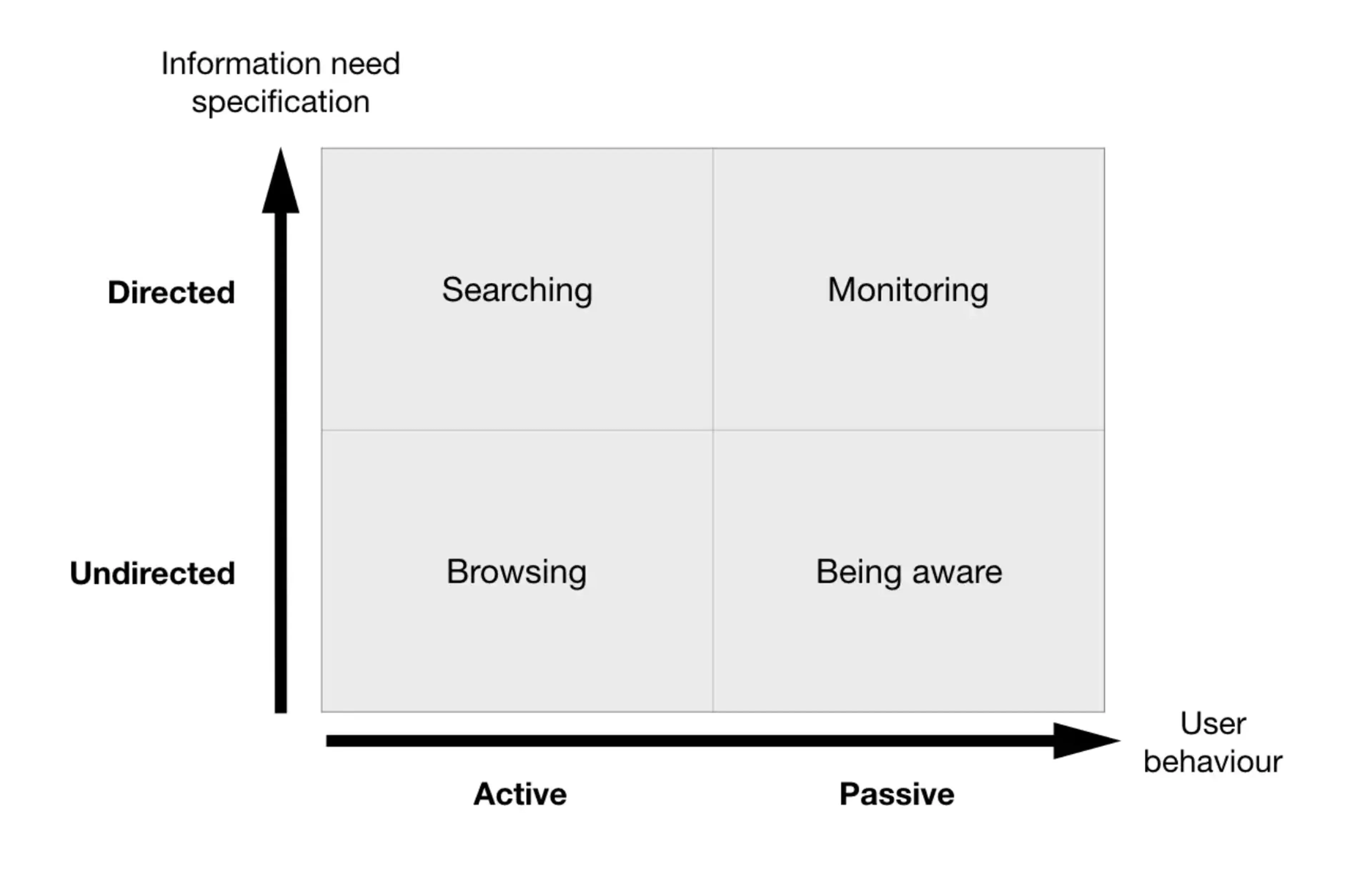
Back in 2002, Dr. Marcia Bates at the University of California created an excellent model for how people find and look for things. It’s simple, true, and applies to most situations. It calls out the different ways in which users will, or won’t, find your product, service, startup, or book.
I use it to prompt design ideas for how to help people know about something, find something, or to increase the chance that it’ll be on their radar when they do go looking. This can be really important when working on critical government services that people need to know about. But it’s equally fun for unpicking the ‘build it and they will come’ belief that occasionally comes with new ideas for websites or podcasts.

A real-world example
Recently, I worked with a government delivery team that had the challenge of improving how people find and apply for visas. There’s a huge range of options to choose from, hundreds of rules for each, and plenty of people not knowing if they need one or choosing the wrong one. The rules for new visas also regularly changed, so what you knew to be true for one year might change in the next.
Traditionally, teams would create detailed guidance to explain all of the rules. By reading the details, the thinking went, people could then make fully informed decisions about what to apply for, and what their choice would entitle them to do.
This model gives a name to a few of the problems with this approach. It assumes that users would already know they might need to do something, and would be actively searching for that guidance, and that providing this alone would be enough.
Instead of a traditional publishing approach, a delivery team prototyped ideas using the stages in this model, to see what would be most effective.
Searching
This is when someone is actively looking for a specific thing and more or less know the words they’re looking for. Searching Google for “register to vote”, “nearest doctor’s practice” or “buy Miele Blizzard CX1” are examples of this.
For the team working on visas, the relevant part of their website was already pretty fantastic at being found by search engines. But they changed the language of individual visa products, moving away from obscure product names toward how users would think to look for it – say, visit, work, or live in a country.
Browsing
Sometimes we don’t know what we’re looking for, but we’re actively looking for something that might do the job. Perhaps something has happened and we don’t know what to do about it – say, a family member can’t work. Is there government support? Or we could be interested in a new vacuum cleaner and ask friends for thoughts, or read reviews and compare options.
The visa team prototyped tools for users who weren’t sure what to do. Things to help people know and choose between options, like a ‘check whether I need a visa’ step by step, and a ‘choose between visas that closely match my situation’ comparison page.
Monitoring
We’re usually not actively looking for things, but we do notice stuff that’s of particular relevance to us. And we take steps to increase the chance of that. We follow people on social media who do similar work, and immediately notice when someone very smart reveals a clever newsletter they’ve come to rely on.
The visa team understood the networks that people in this situation typically build. They designed for these different channels to raise visibility of important things to know. Everything from making content that was easy for people to share on immigration forums, to running large scale advertising campaigns to raise awareness of things people needed to do.
Being aware
Most of the time we’re not looking for anything at all. Yet there are still things we should know about. Organisations might try to tell us things so we don’t ignore or forget them, like when an accountant emails you to do something.
Because of the work of delivery teams, you now get a text or email to tell you your passport or visa is due to expire, without having to think about it. Or that time you turned up at an airport only to realise you were meant to get a visit visa, luckily someone had designed an instant service that worked on your phone, to save you missing your flight.
We already know most people won’t be looking for our product or service. And that people do the wrong things and fail to do the right things. This model reminds us that we can design for these situations too.