
Finding services on government websites: Progress, pain points and potential
Earlier this year Public Digital was invited to assist Bloomberg Philanthropies and the Government of Kyiv in making design decisions about how the City presented services through its main website to citizens and businesses.
Part of that work involved thinking about where to best place services, how to organise them and how to name things.
One aspect of our support involved reviewing websites from peer governments. From that study, it is clear government websites have made a lot of progress in the ways they present service information and transactions for citizens and business. But there is plenty of room for improvement, and a lot to be gained by those governments through sharing what works with one another.
Radical by the standards of the day
In 2012, I stood before a room filled with heads of news from government departments and agencies and walked them through the changes we were making to news content and formats on GOV.UK.
The headline? News content would no longer dominate departmental landing pages and would be deprioritised on the GOV.UK homepage itself to raise the profile of information and links that guided users to services. Putting it diplomatically, my announcements received a lukewarm reception.
I understood their reaction. Back then, news content was the main focus for web teams, taking up most of their efforts. It was also the most frequently updated content on government websites, with news items sometimes published up to five times a day. ‘News’ featured prominently in most top nav bars and on homepages, and also won top placement on the main grids or carousels.
From the analytics we had for departmental websites in the UK, however, we could see that little more than two percent of the annual traffic for these sites was going to news. Of those users coming to the sites for news, the vast majority were finding it not from homepages and nav bars but from external search engines and social media links.
Despite extensive analytics data and user feedback highlighting clear frustration with news content cluttering searches and navigation — hindering users from accessing essential services — the changes we made to how and when news appeared on GOV.UK felt among the most transformative steps in redefining the purpose of government websites.
Being bold
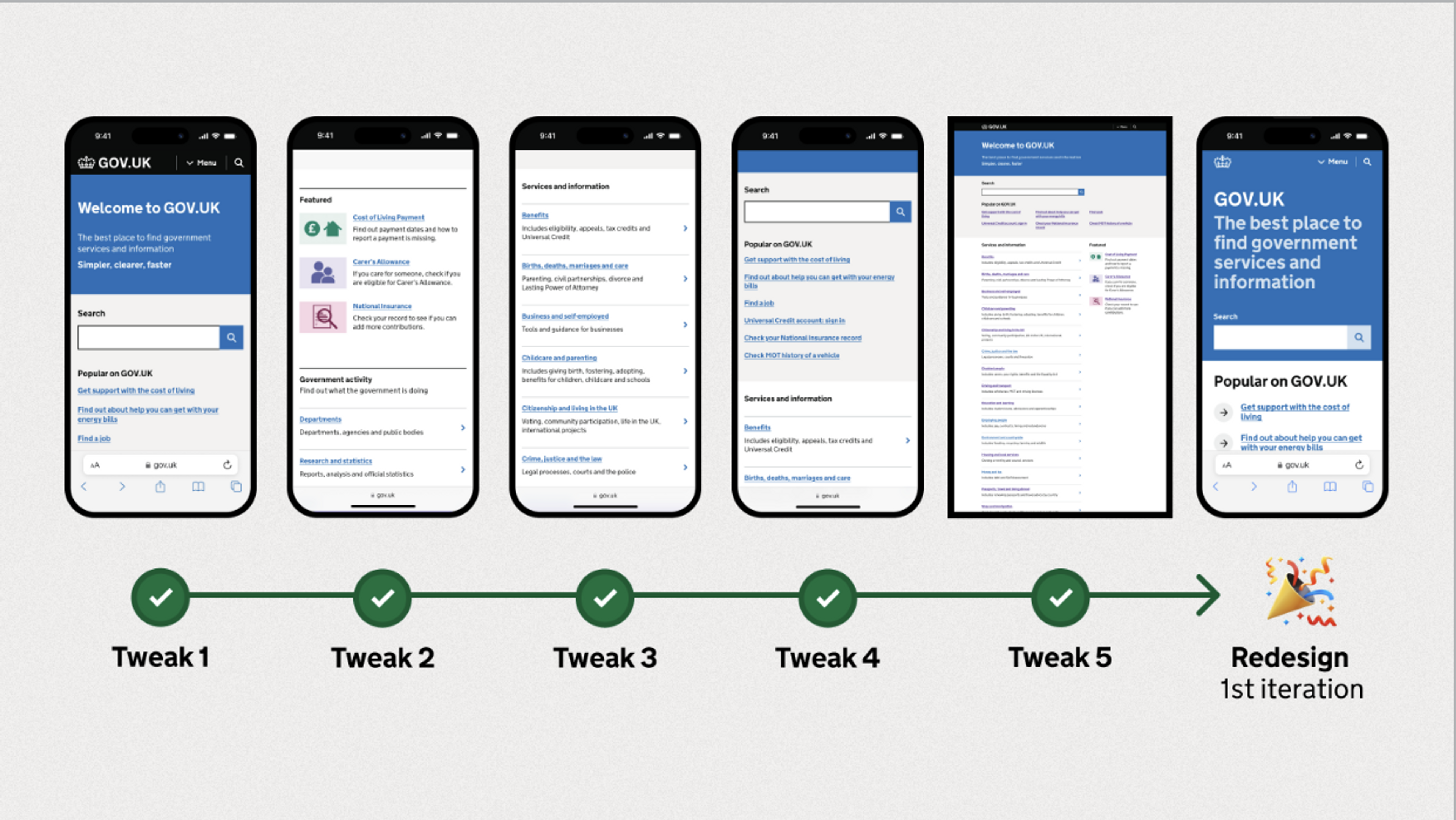
We pressed on and delivered on what people told us they needed most. News releases dropped out of prominence on the homepage and departmental landing pages, replaced by information and signposting for services. Users responded positively in their actions and their feedback.
Yet, for years after GOV.UK’s launch it continued to look like an oddity when screenshotted next to many other government and public sector sites in the UK and around the world. News and marketing-style content still dominated and people had to dig deep for services.
We kept studying the data, talking to users, making iterations and posting about our rationale, and over the years we grew in confidence that, by prioritising informational and transactional services, we had done a good thing as far as users were concerned.
Supporting the City of Kyiv
In August 2024, we agreed to help the City of Kyiv inform decisions about services on its main website by doing some comparative analysis aimed at identifying trends across the sites of peer governments globally.
We reviewed eight national or central government sites and 17 city or municipal sites; some were nominated by Kyiv, others were selected at random, and in the end our sample spanned the continents. For the team, this was a fascinating opportunity to learn how governments were running their main websites a decade on from GOV.UK’s ‘radical’ steps.
Here are some of the notable observations from our study, offering insights into what seems to be working well and where there may be opportunities for improvement.
In the service of services
All but one of the governments we looked at gave priority to ‘Services’ on their main website. They gave prominence to ‘Services’ on their homepage, and included it as the main option in their ‘global’ navigation bar.
We had expected to see this happen in some cases but to see it happening in so many was striking. We assume they have made these user-centred design decisions based on data and feedback similar to what has guided GOV.UK’s iterations over the years.
Additionally, most jurisdictions highlighted ‘popular services’ in a section of their homepage. Looking back into the web archives, however, there appeared to be little curation of these sections, and the basis of this ‘popularity’ was not made clear.
Categories all the way down
The government sites in our sample offered between 189 and 7168 services. Unsurprisingly, most governments categorised these services to help users find what they needed during their visit.
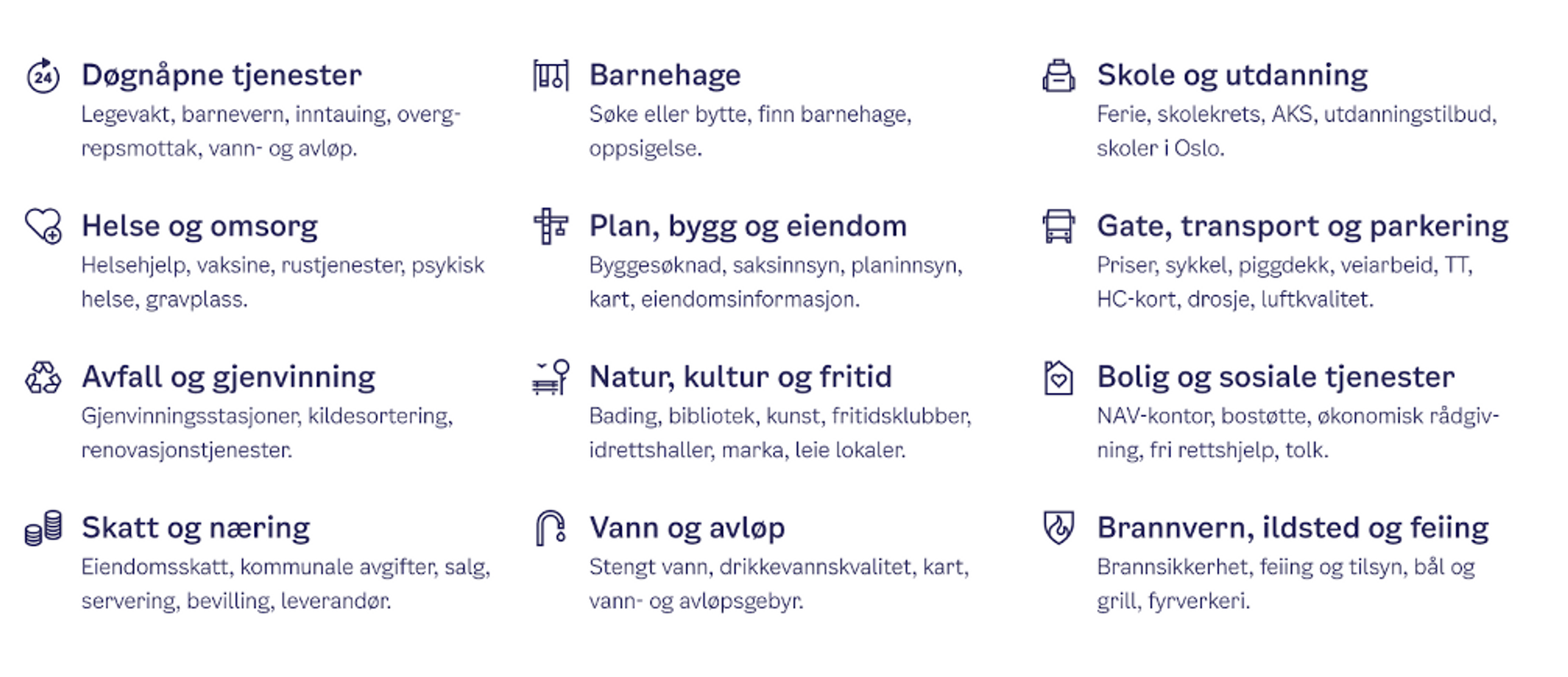
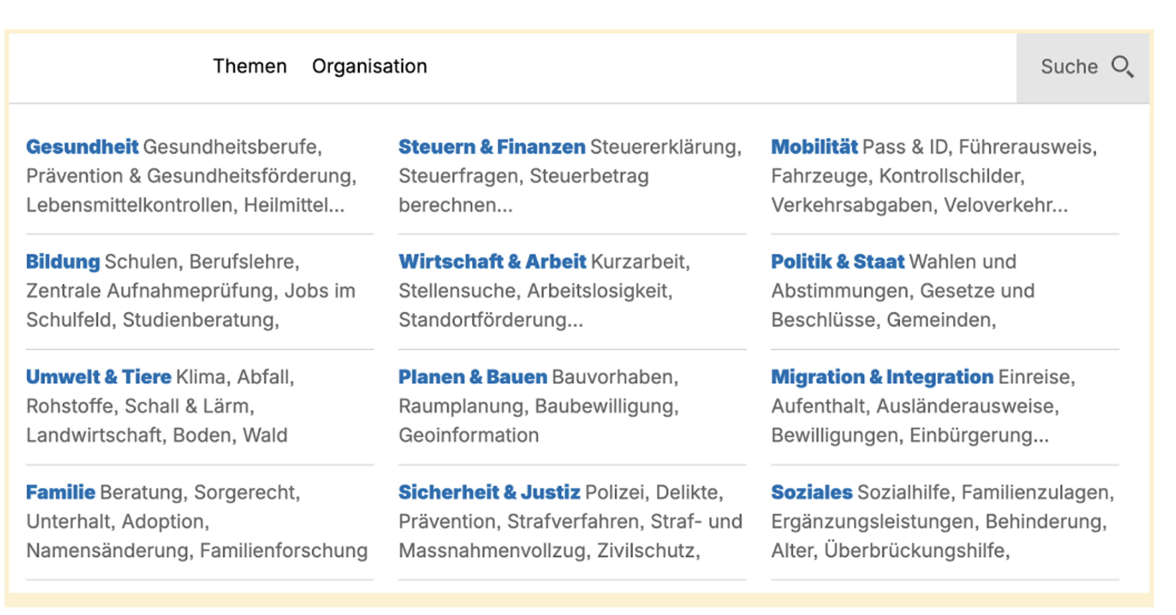
Most governments led with topic-based categories, with 14 topics used to organise their services on average. What was striking was just how similar the top-level topics that the countries and cities used; with common choices including ‘Business’, ‘Environment’, ‘Health’, ‘Social benefits’ and ‘Transport’. So similar were the way these categories were laid out on the homepages across the sample, that it wouldn’t be a surprise that someone in Amsterdam familiar with their government’s website would have a good idea of what they were looking at if they landed on the website for the City of Buenos Aires, even with the language difference.
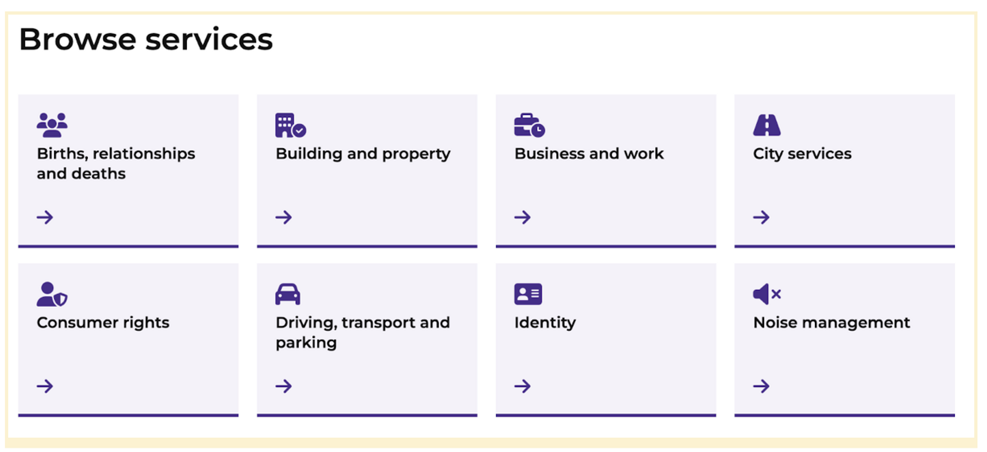
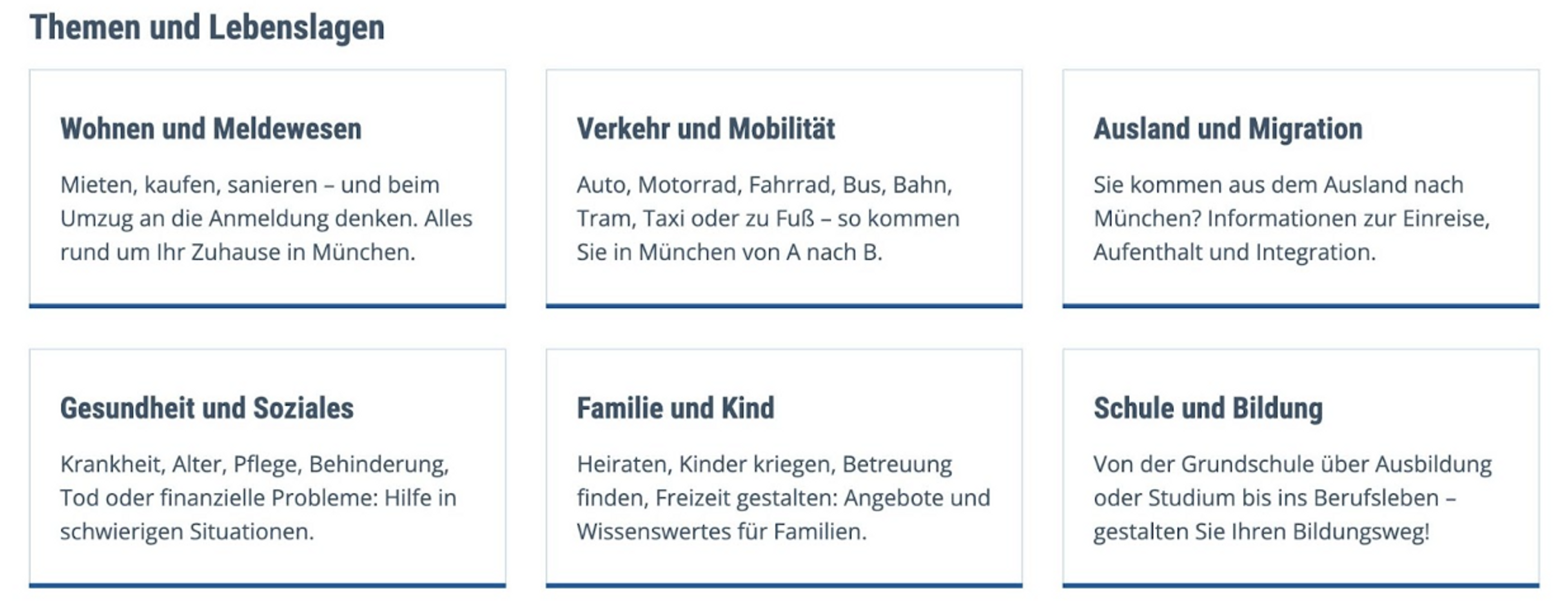
There was some variety in the supplementary categorisation, used alongside the top-level topics. Some, additionally, allowed browsing by alphabetical order, responsible departments, life events and user types; but there were no stand-out common patterns.
While the number and naming of the top-level topics were similar across the sample, it was in the sub-category topics (the secondary and tertiary levels) that we encountered the greatest variance: in terms of numbers of categories, how things are organised within the sub categories, and what things are called. There’s lots of obvious and subtle reasons, which are to do with the polity, laws, culture and geography of the places: examples included ‘Ports and harbours’, ‘Withholding tax’, ‘Sex work’ and ‘Ring of Fire’. Some sites had tens of sub-topics, while others had hundreds.
Helping users navigate governments
There was also a lot of variety in how local governments linked out to services provided by central governments. People who engage with local governments also need to engage with national governments. Sometimes it’s clear which government does what, but sometimes it can be vague (think about registering a birth, which is something you might do through a local government where the service is owned by the central government).
Most city sites in our sample did link up with national sites; but they employed a wide range of design patterns and content rules to do so. There were some cases, however, where the local governments didn’t link out or include information on services provided by other governments in that country. Again, the bases for these decisions were not particularly clear, as very few sites carried a clear proposition explaining to the user what was in and out of scope for the site.

Surface-level improvements
When it came to the language used to name and explain things, we were pleased to see a good many sites using active, verb-based naming conventions for services and plain, concise language to explain the detail of their scope and how to access them.
But we also saw a lot of convoluted graphic and interactive design, poor internal search results (even for the most common of tasks such as waste collection and finding contact information), as well as some very long and obscure web addresses suitable only for machines.
We also saw a common pattern of hiding information and tasks behind log-ins, or things that were available in an app but not on the companion website or vice-versa.
Most disappointing was seeing vital information and forms stuck in Word documents and PDF attachments on websites that otherwise claimed to be providing ‘comprehensive online services’ for citizens in ‘smart cities’. This suggests that while clearly signposting services is a good start, there is still much important work to be done to make it easy for everyone to get those services in accessible, reliable and secure ways.
Benefits of working in the open
Although we documented our observations for Kyiv by identifying apparent trends on peer sites and applying judgement based on our experience, we could not assess whether these sites were performing well. This is largely because very few governments share insights into user feedback, performance data, or the decision-making processes behind iterations, new developments, or the abandonment of designs and functionalities.
In this sense GOV.UK remains an oddity. The team behind GOV.UK still stands out as one of the only examples where information about what users think and experience on the site is openly shared alongside the resulting hypotheses and decisions in blog posts and change notes on code repositories. Which is unfortunate, because there is clearly a community of practitioners out there ready to connect with one another. We’d like to see more teams developing these websites openly, fostering a community of practice.
Ready to lend a hand
Since 2015, Public Digital has helped a number of governments consolidate, improve and transform their web estates, including governments in Peru, New York, Nova Scotia, Edo State, as well as public sector organisations across the UK. In doing so, we’ve seen the benefits of making connections between government teams.
While we’ve seen great progress being made, there are evidently many public (as well as private) sector organisations who still struggle with sprawling, inconsistent, incoherent and costly web estates. These are solvable problems with benefits that extend beyond digital channels into deeper aspects of designing and operating public services.
If you’d like to talk more about tackling these challenges and to learn more about how we can help, please get in touch.
Written by

Ross Ferguson
Director
