How to fix the government websites
Read more
Recently in the UK we’ve seen a change of Monarch, a change of Government and several changes in Department names.
Previously this would have meant visual chaos – many changes to government communications and the ensuing rows over costs and logos, as well as confusion for the user. Now, thanks to GOV.UK, it’s a simple code change. That’s worth further explanation, which I’ll try and do with this blog post.
Earlier this year, GOV.UK updated its logo to reflect the accession of King Charles as monarch. You may not even have noticed it happening. The seamlessness of that transition is thanks to the team there today and the hard work which went into the creation of a single logo back in 2012. This was part of the work of the Government Digital Service (GDS) in delivering GOV.UK, where I led the team responsible for its design and branding.
Ultimately logos are about trust. Leaders - and later, governments - have always needed a symbol which verifies that any content they are distributing comes directly from them. Essentially: that it can be trusted. In an age of misinformation, that trust for government-sourced content is more important than ever.
Logos are an interesting part of what makes a service’s design. They tend to be highly emotive, carrying the burden of needing to represent everything and everyone, however impossible that may be. It’s no surprise, then, that they tend to attract a lot of political attention.
The story of GOV.UK’s single logo shows the power of radical simplicity as a principle in this area of service design, in the public sector and beyond it. Keeping a logo simple, functional - almost invisible - allows it to transcend the politics and cultural debate of its context. It minimises the ceremony and expense of updating it to reflect change.
And it enables the real focus to stay on the stuff that really matters: the service beneath it.
Britain has a rich tradition of applying design to the public sector.
During the postwar era, as Britain expanded its public services, its design industry was thriving. The government began to adopt that design capability for long-term, public sector projects, producing lasting British design features like post boxes and road signs.
However, that changed in the following decades with the evolution of government communication and arrival of the television age. As the government expanded its marketing campaigns, the engine behind British design became dominated by this campaign-mindset: Applying design to shorter term approaches, for short-term projects.
This kind of short-term design culture was reflected in the landscape of government when the early GDS began its work on GOV.UK in 2011.
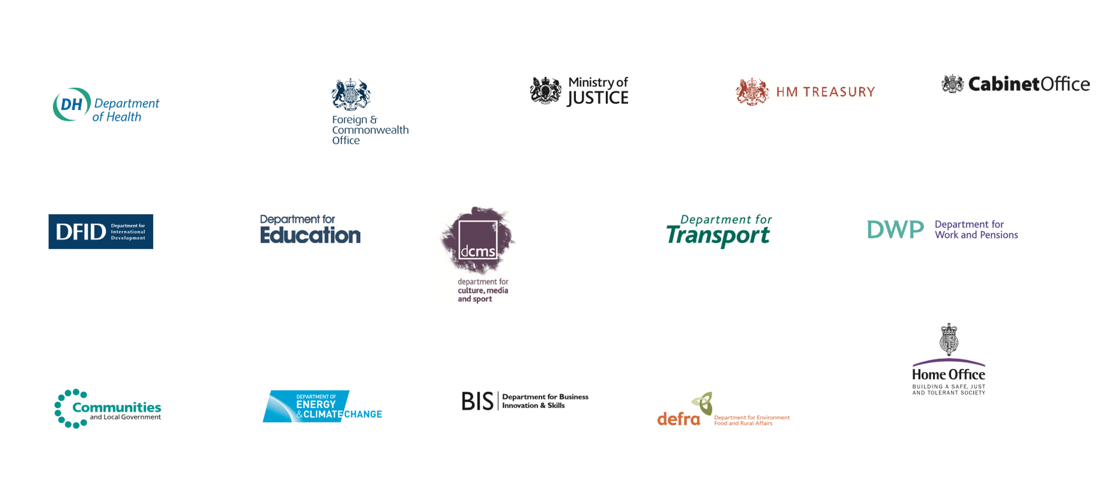
Back then, each government department had its own customised logo, the product of government using marketing agencies to help ministers establish a distinctive identity or ‘brand’ for their ministry.
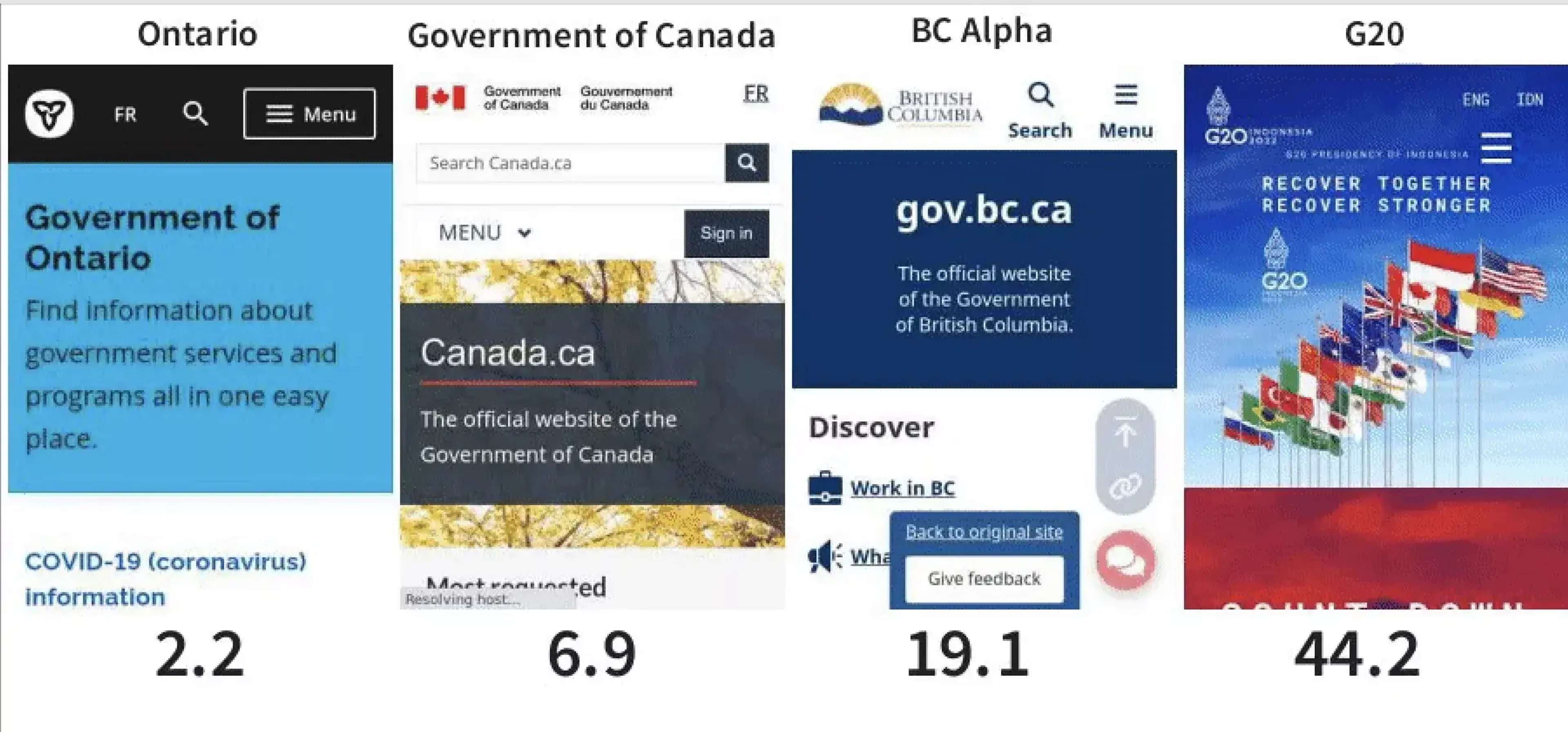
The result was numerous government departments, with numerous different logos. This spread of logos went hand-in-hand with the spread of nearly 2,000 department and government agency websites.
When a user accesses a government service, they aren’t concerned with which department is responsible for which function. Whether they’re applying for a passport or checking their tax code, they think of all of these interactions as with ‘government’. As such, while the public were largely unaffected by the variety of government logos, the volume of government websites created a confusing system with a poor user experience.
And for the departments themselves, running multiple websites meant complexity and expense, particularly when government often operates cross-departmentally.
When Martha Lane Fox advocated for the creation of one government website, the proposal won out because it promised a more user-centred service, in the form of a radically simple single user experience. With only one government website, citizens don’t need to understand the operational structure of government in order to use its services.
GDS’ mission was therefore to design one website - GOV.UK - with one user experience. And to achieve that, the website needed a single visual identity.
But with a messy legacy of numerous department logos, what would that visual identity look like?
Which is why, when we started work on a single logo to represent GOV.UK, we began by looking at which symbols the British public trust the most.
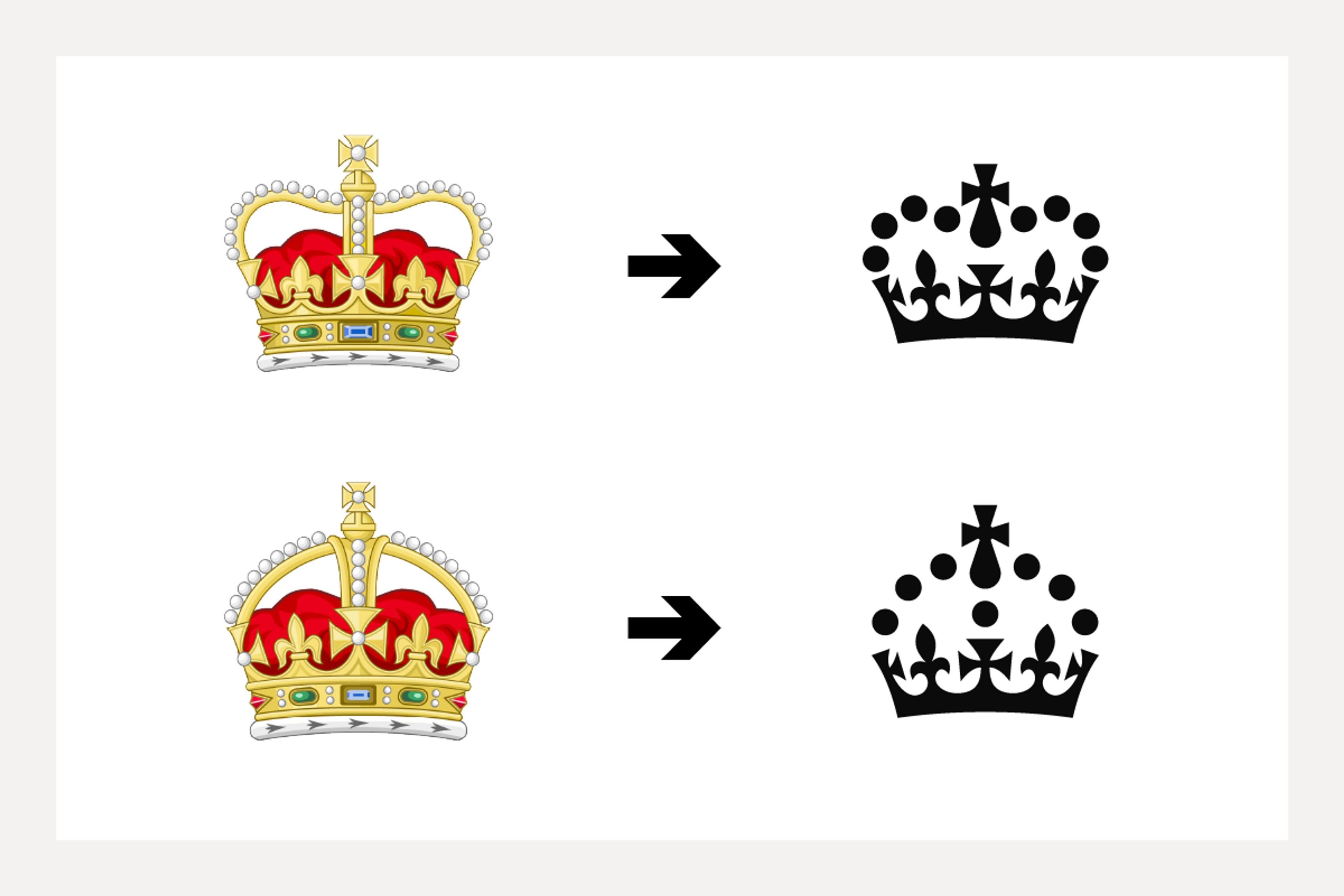
While the UK’s royal coat of arms is the official state symbol of His Majesty’s Government and appears in the footer of GOV.UK, but we needed something simpler that could work at smaller sizes for the visual identity of GOV.UK.
In developing the logo, we tested other familiar symbols, including a crown icon similar to the one from ‘keep calm and carry on’ poster, a design which actually originated as an unused wartime slogan from the 1930s.
Based on its high scores in relation to trust, we selected this to be GOV.UK’s logo, and worked with the Garter Principal King of Arms, the monarch’s principal adviser on heraldry, to confirm the final version
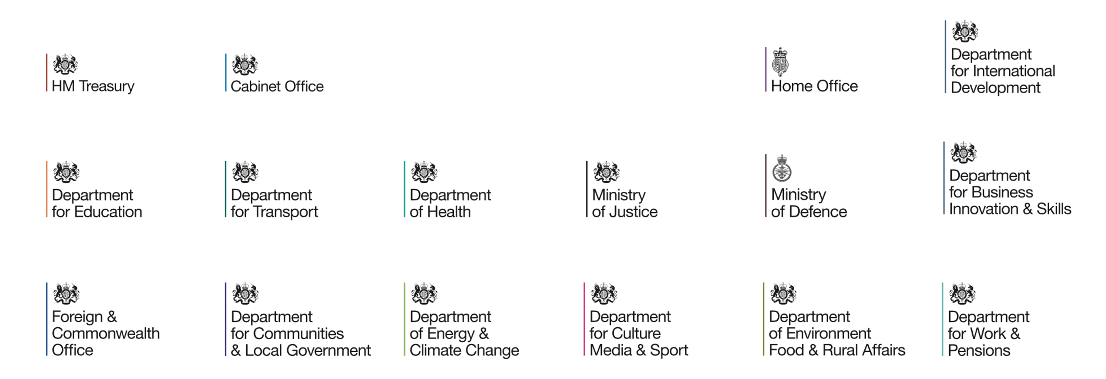
In parallel to our work the Government Communication Service had been phasing in a unified identity system and it made sense to deploy that across GOV.UK. Afterall, more people visit GOV.UK than any government building.
Once the complexity - both administrative and emotive - of adjusting to GOV.UK’s new logo was complete, the rewards of its simplicity started to materialise.
Government is constantly changing its own structural design. Even beyond the frequent appointment of new ministers, it creates new departments, changes the name of existing departments, or merges two departments together.
A significant political event like Brexit triggered an unprecedented amount of this kind of change.
Before the creation of a single logo, government restructures like this would have demanded a costly administrative and design workload. And depending on the nature of the change they represented, they might also have stirred up a frenzy of debate. For instance, at the height of Brexit, the design of a logo for the Department for Exiting the European Union could well have been a political and press nightmare. Every potential logo idea loaded with symbolism. I tweeted about that at the time.
There’s a very recent example in the change from the campaign sounding Department for Levelling Up, Housing & Communities back to the more sober Ministry of Housing, Communities & Local Government.
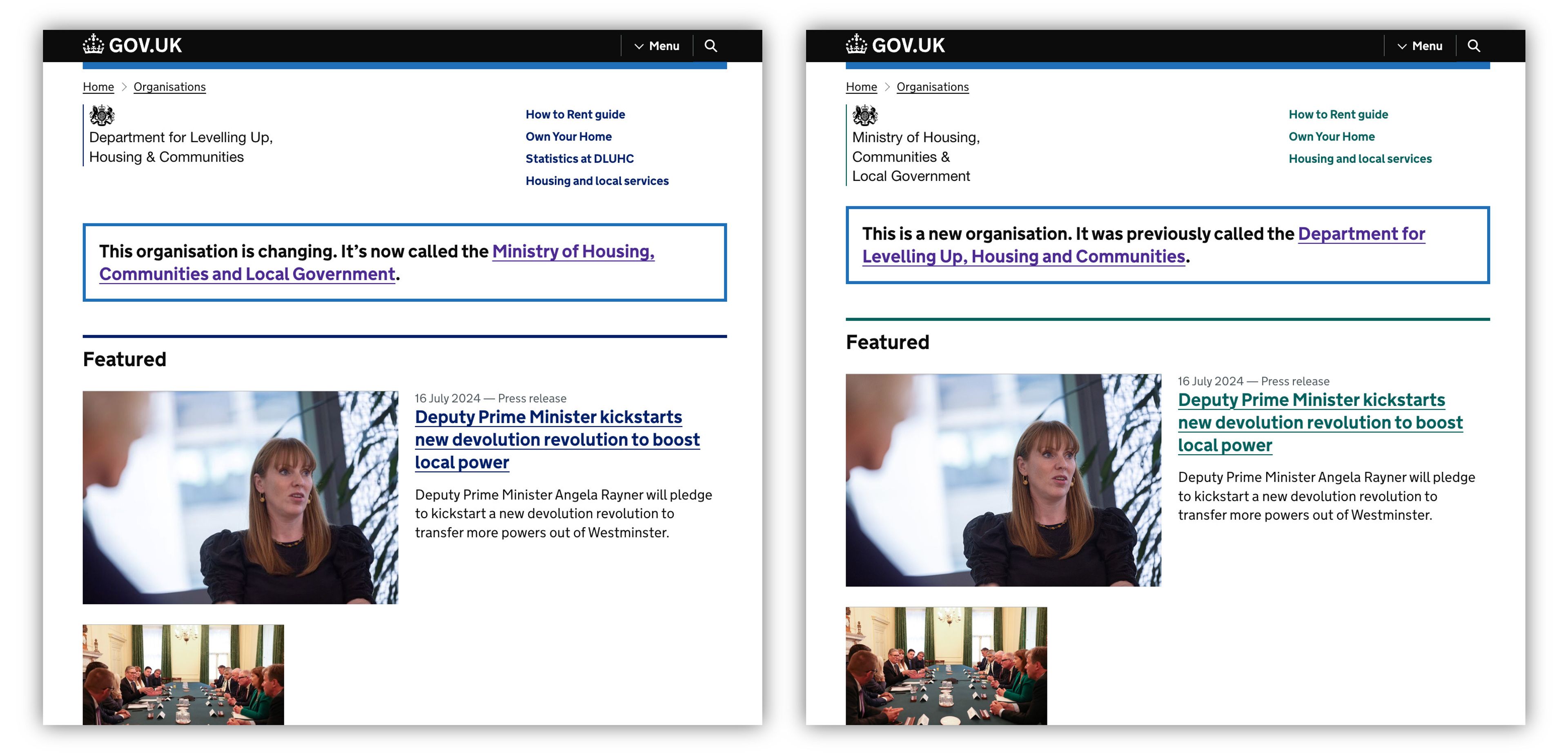
With a single logo, all that has to be done when departments change is an edit to the html of the relevant section of GOV.UK. This change is so mundane it attracts no scrutiny, even in the most turbulent political contexts. No drama, just a simple code change, as it should be.
The same is true for when the monarchy undergoes change. Designing a ‘symbol for the new king’ could well have been a politically risky and expensive endeavour but GOV.UK’s single visual identity meant that the transition to a different symbol - a new crown to reflect Charles’ Royal Cypher - was zero fuss and almost zero cost, and one which most people wouldn’t even have noticed.
That simplicity, and ultimately that trust, is hard won and takes a long time to earn. One of the original GDS design principles was ‘do the hard work to make it simple’.
This is a perfect example of this and the team at GDS deserve huge credit for continuing to live those principles.
Further credits are needed for the original work and Mark Hurrell has done that elegantly on his blog post GOV.UK identity and brand.
It’s worth repeating the credits here in full: Design direction from Russell Davies and Ben Terrett, creative direction from Beeker Northam, designed with Paul Annett, Henry Hadlow, Stephen McCarthy, and Guy Moorhouse collaborating across multiple agile teams. GDS Transport by Henrik Kubel at A2Type, and design feedback from Margaret Calvert.
Single government identity: Government Communications Service.

CEO and Founder
